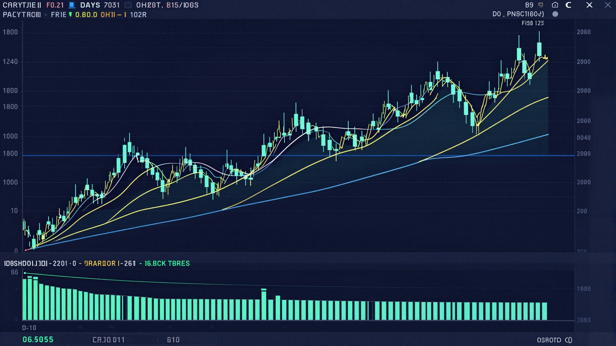
A stock chart is not a crystal ball. It doesn’t predict the future. But it does something almost as valuable: it tells you exactly what every buyer and seller has done with real money over any time period you choose — and patterns in that behavior repeat with enough frequency to be worth understanding.
This guide teaches you how to read stock charts from the ground up. Not the overcomplicated version that overwhelms beginners. The practical version — the core concepts that actually matter for making smarter investment decisions, whether you’re a long-term investor or an active trader.
📊 What a Stock Chart Actually Shows
Before learning to read a chart, understand what it is: a visual record of price history.
Every point on a stock chart represents a transaction — a specific price at which a willing buyer and a willing seller agreed to exchange shares. The chart aggregates millions of these transactions into a visual format that reveals patterns, trends, and momentum that raw numbers can’t convey.
The horizontal axis (X) represents time. The vertical axis (Y) represents price. Everything else — indicators, overlays, volume bars — is derived from these two fundamental dimensions.
Stock charts are available for any timeframe: 1-minute intervals for day traders, daily candles for swing traders, weekly or monthly charts for long-term investors. The timeframe you use depends entirely on your investment horizon. Long-term investors should focus on weekly and monthly charts; they’re less susceptible to noise and more revealing of genuine trends.
🕯️ Understanding Candlestick Charts (The Standard)
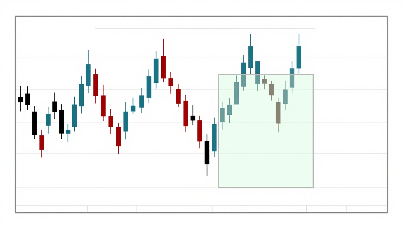
The most widely used chart type is the candlestick chart, developed by Japanese rice traders in the 18th century and adopted globally by modern markets. Each “candle” represents one period of trading — one day, one week, one hour, depending on your chart settings.
Every candlestick contains four pieces of information:
- 🟢 Open: The price at which the first trade of the period occurred
- 🔴 Close: The price of the last trade of the period
- ⬆️ High: The highest price reached during the period
- ⬇️ Low: The lowest price reached during the period
The rectangular “body” of the candle spans from open to close. The thin lines extending above and below (called “wicks” or “shadows”) show the high and low extremes.
Green (or white) candle: Close was higher than open — price rose during the period. Bullish signal.
Red (or black) candle: Close was lower than open — price fell during the period. Bearish signal.
A long body indicates strong directional momentum. A short body suggests indecision. Long wicks (especially relative to a small body) signal rejection — the market tried to push price in one direction but sellers (or buyers) pushed it back. These wicks are some of the most informative elements on any chart.
📉 The Three Types of Charts
While candlesticks dominate modern chart reading, you’ll encounter three main chart types:
Line Chart
The simplest. Connects closing prices with a single line. Excellent for identifying long-term trends at a glance. Strips away intraday noise. Best for long-term investors who want a clean view of directional movement without the complexity of candlestick patterns.
Candlestick Chart
Standard for most traders and active investors. Provides open, high, low, and close for each period. Reveals intraday (or intra-period) psychology through wick patterns. The most information-dense standard chart type.
Bar Chart (OHLC Chart)
Shows the same four data points as candlesticks (open, high, low, close) but in a different visual format. Less visually intuitive than candlesticks but functionally equivalent. Less commonly used in modern platforms.
📈 Trend: The Most Important Concept in Chart Reading
Before indicators, before patterns, before anything else — identify the trend. This single habit will improve your chart reading more than any other technique.
Markets move in three directions:
- 🐂 Uptrend: Series of higher highs and higher lows. Each peak is higher than the last; each trough is higher than the last. Strong buying pressure consistently overwhelms selling pressure.
- 🐻 Downtrend: Series of lower highs and lower lows. Each peak is lower than the previous; each trough is lower than the previous. Sellers consistently overwhelm buyers.
- ➡️ Sideways (Consolidation): Price bouncing between a relatively flat range. Neither buyers nor sellers dominate. Often precedes a significant directional move.
The practical application: trading or investing against the dominant trend is statistically disadvantaged. Long-term investors should prioritize stocks in uptrends. Short-term traders recognize trend direction before every trade. “The trend is your friend” is a cliché because it’s consistently true in price data across every market and timeframe.
Identifying Trendlines
Draw a trendline by connecting at least two significant lows in an uptrend (or two significant highs in a downtrend). The more times price touches the trendline and bounces without breaking through, the stronger the trend. A decisive break below an uptrend line — especially on high volume — signals potential trend change.
🔴🟢 Support and Resistance: The Map of Market Memory
Support and resistance are the most powerful concepts in chart analysis. Markets have memory. Prices that acted as barriers in the past tend to act as barriers again in the future — because the same human behaviors that created those price levels repeat.
Support
A support level is a price zone where buying interest is strong enough to prevent further decline. Think of it as a floor. When price approaches a support level, buyers who missed buying at that price previously step in, creating demand that halts the decline and often reverses it.
How to identify support: look for price levels where the chart has bounced upward multiple times. The more times price has tested and held a support level, the more significant (and reliable) that level becomes.
Resistance
A resistance level is a price zone where selling pressure is strong enough to prevent further advance — a ceiling. When price approaches resistance, investors who bought at lower prices sell to take profits, and short sellers initiate positions, creating supply that halts the advance.
The Role Reversal Principle
One of the most useful principles in chart reading: when a support level is broken decisively, it often becomes resistance on any subsequent rally. When a resistance level is broken decisively (a “breakout”), it often becomes support on any subsequent pullback. This role reversal occurs because the same price level that was significant once retains psychological significance for market participants.
📊 Volume: The Confirmation Signal
Price tells you what happened. Volume tells you how convinced the market was.
Volume is the number of shares traded during a period, typically displayed as a bar chart at the bottom of the price chart. High volume means many participants agreed on a price. Low volume means fewer participants were involved — and the move may be less reliable.
Key volume principles:
- ✅ Price rise on high volume: Genuine bullish conviction. Many buyers actively pushing price higher. Strong signal.
- ⚠️ Price rise on low volume: Lack of conviction. Price may be rising due to limited sellers rather than strong buying demand. Weaker signal, potentially reversible.
- ✅ Price decline on high volume: Strong selling pressure. Significant distribution — institutional investors may be exiting positions.
- ⚠️ Price decline on low volume: Weak selling. May represent a normal pullback within an uptrend rather than a genuine trend change.
The most important volume signal: a breakout above resistance on significantly above-average volume is one of the highest-conviction chart signals available. Breakouts on low volume fail far more frequently.
〰️ Moving Averages: Smoothing the Noise
Raw price data is noisy — it zigzags up and down constantly, making trend identification difficult. Moving averages smooth this noise by averaging price over a defined period, creating a single flowing line that reveals the underlying trend direction.
Simple Moving Average (SMA)
The arithmetic average of closing prices over N periods. A 50-day SMA averages the last 50 days of closing prices. As each new day closes, the oldest day drops out and the newest day is added.
Key moving averages widely watched by institutional and retail investors:
- 20-day SMA: Short-term trend. Used by swing traders.
- 50-day SMA: Medium-term trend. Often cited in financial media. A cross below the 50-day is frequently treated as a warning signal.
- 200-day SMA: Long-term trend. The most widely watched single indicator. Stock trading above its 200-day SMA is generally considered in a long-term uptrend. Below it: caution territory.
Exponential Moving Average (EMA)
Similar to SMA but weights recent prices more heavily, making it more responsive to recent price changes. The 12-day and 26-day EMAs are the foundation of the MACD indicator. The 9-day EMA is frequently used for short-term trend identification.
The Golden Cross and Death Cross
Two widely followed moving average signals:
- 🌟 Golden Cross: The 50-day SMA crosses above the 200-day SMA. Historically associated with the beginning of long-term uptrends. Broadly bullish signal.
- 💀 Death Cross: The 50-day SMA crosses below the 200-day SMA. Historically associated with the beginning of prolonged downtrends. Broadly bearish signal.
These signals are lagging — they confirm trends already underway rather than predict them. But for long-term investors, they provide a useful objective framework for assessing overall market and individual stock health.
🔧 Key Technical Indicators (The Most Useful Ones)
Dozens of technical indicators exist. Most are redundant. These four cover the core dimensions of price analysis:
RSI — Relative Strength Index
Measures the speed and magnitude of recent price changes to assess overbought and oversold conditions. Scaled from 0 to 100.
- RSI above 70: Potentially overbought — price has risen rapidly, may be due for a pullback
- RSI below 30: Potentially oversold — price has fallen sharply, may be due for a bounce
- RSI divergence: When price makes a new high but RSI makes a lower high — a warning signal of weakening momentum
MACD — Moving Average Convergence Divergence
Shows the relationship between two EMAs (typically 12-day and 26-day). Consists of a MACD line, a signal line (9-day EMA of MACD), and a histogram. When MACD crosses above the signal line: bullish momentum. Below: bearish. Widely used for momentum confirmation and divergence identification.
Bollinger Bands
Two bands plotted two standard deviations above and below a 20-day SMA. When bands are narrow (squeezing): low volatility, often preceding a significant move. When price touches the upper band: extended to the upside. Lower band: extended to the downside. Not buy/sell signals alone — context matters.
Volume Weighted Average Price (VWAP)
The average price weighted by volume. Primarily used by institutional traders as a benchmark. Retail investors use it as a dynamic support/resistance reference during intraday trading. Less relevant for long-term investors on daily/weekly charts.
🕯️ Common Candlestick Patterns Worth Knowing
Individual and multi-candle patterns carry predictive value — not because charts cause market movements, but because the same human psychology (fear, greed, exhaustion, conviction) produces similar price action patterns repeatedly.
Single Candle Patterns
Doji: Open and close at nearly the same price — minimal body, often with significant wicks. Represents indecision. Often signals trend reversal when appearing after a strong directional move.
Hammer: Small body at the top of a long lower wick. Appears in downtrends. Signals that sellers drove price significantly lower but buyers stepped in and pushed it back up. Potentially bullish reversal signal.
Shooting Star: Small body at the bottom of a long upper wick. Appears in uptrends. Signals that buyers pushed price significantly higher but sellers overwhelmed them and pushed it back down. Potentially bearish reversal signal.
Two-Candle Patterns
Bullish Engulfing: A small red candle followed by a large green candle whose body completely engulfs the previous candle’s body. Strong bullish reversal signal — buyers overwhelmed sellers decisively.
Bearish Engulfing: The reverse. Small green candle followed by a large red candle that engulfs it. Strong bearish reversal signal.
Important Note on Patterns
No pattern works 100% of the time. Candlestick patterns are probability signals — they indicate a higher likelihood of a particular outcome, not certainty. Always use patterns in context: the broader trend, support/resistance levels, volume confirmation, and multiple timeframe agreement significantly improve pattern reliability.
📐 Chart Timeframes: Choosing the Right Lens
The same stock looks completely different on a 5-minute chart versus a weekly chart. Selecting the appropriate timeframe for your investment style is essential:
- ⚡ 1-minute / 5-minute: Day traders only. Extreme noise. Requires full-time attention and rapid execution. Not appropriate for most retail investors.
- 📅 Daily: Standard for swing traders and medium-term investors. Each candle represents one trading day. Good balance of detail and trend visibility.
- 📆 Weekly: Ideal for long-term investors. Filters daily noise. Reveals significant support/resistance levels and multi-month trends more clearly than daily charts.
- 🗓️ Monthly: Strategic overview. Best for assessing decade-scale trends and identifying major support/resistance zones. Useful for long-term position sizing decisions.
Professional traders use multiple timeframe analysis: identify trend on a longer timeframe (weekly), find entry opportunities on a shorter timeframe (daily). This alignment of multiple timeframes significantly improves trade reliability.
🧠 Chart Reading in Practice: A Decision Framework
When you open any stock chart, work through this sequence:
- 🔍 Identify the trend: Higher highs and higher lows (uptrend)? Lower highs and lower lows (downtrend)? Sideways range?
- 📍 Mark key support and resistance: Where has price bounced or stalled repeatedly? These levels matter going forward.
- 〰️ Check moving averages: Is price above or below its 50-day and 200-day SMAs? Are moving averages trending up or down?
- 📊 Assess volume: Is recent volume confirming price moves? Rising price on increasing volume is healthy. Rising price on declining volume warrants caution.
- 📉 Check RSI: Is price potentially overbought (RSI > 70) or oversold (RSI < 30)?
- 🕯️ Look for patterns: Are there any significant candlestick or chart patterns at current price levels?
- 🔗 Apply context: Does the chart picture align with fundamental quality? Strong company + strong chart is a higher-conviction setup than chart alone.
⚠️ What Charts Cannot Tell You
Chart literacy includes understanding the limits of technical analysis — as important as the techniques themselves.
Charts don’t reveal fundamentals: A stock can look technically perfect — uptrend, above all moving averages, strong volume — while the underlying business is deteriorating. Charts reflect price history, not business quality. Combining technical and fundamental analysis produces better outcomes than either alone.
Patterns fail regularly: No technical pattern works all the time. Markets are influenced by news, earnings surprises, macro events, and institutional positioning that can override any technical setup. Always use appropriate position sizing and stop-losses rather than betting everything on a pattern.
Charts are self-referential: Many market participants watch the same levels, the same moving averages, the same patterns. When enough people act on the same signal, the signal becomes self-fulfilling — but this also means it can create crowded trades where everyone heads for the exit simultaneously.
Past patterns don’t guarantee future results: The standard disclaimer exists for a reason. Technical analysis identifies probability, not certainty. Treat every setup as a probability play, not a guaranteed outcome.
✅ Key Takeaways
- 🔹 Stock charts are visual records of price history — not predictions, but maps of market behavior
- 🔹 Candlestick charts show open, high, low, close for each period — the most information-dense standard format
- 🔹 Trend identification (uptrend / downtrend / sideways) is the first and most important chart reading skill
- 🔹 Support and resistance levels represent market memory — prices that mattered before tend to matter again
- 🔹 Volume confirms price moves — high-volume breakouts are more reliable than low-volume ones
- 🔹 The 50-day and 200-day SMAs are the most widely watched technical reference levels
- 🔹 RSI identifies overbought/oversold conditions; MACD shows momentum direction
- 🔹 Always read charts in context of the broader trend, fundamental quality, and multiple timeframes
- 🔹 Technical analysis improves entry and exit timing — it doesn’t replace investment research
Chart reading is a skill that compounds with practice. Start with the basics — trend, support/resistance, volume — and add indicators gradually as you grow comfortable. The investors who use charts most effectively are those who use them to confirm what fundamentals already suggest, not as a replacement for understanding what they’re actually investing in.
🔍 Applying Chart Reading to Real Investment Decisions
Theory without application is just memorization. Here’s how to integrate chart reading into a practical investment process for long-term investors — not day traders.
Screening for Strong Charts
Most stock screeners allow you to filter by technical criteria. For long-term investors, useful filters include: price above 50-day and 200-day SMA, RSI between 40 and 70 (trending but not overextended), and 52-week high proximity (stocks making new highs often continue higher). This technical pre-screening narrows a universe of thousands of stocks to a more manageable list worth fundamental research.
Using Charts to Time Entry
Even if you’re a fundamental investor who cares primarily about business quality, charts help avoid buying at terrible prices. Buying a great company at peak momentum — RSI above 80, price extended far above moving averages after a 40% run — produces poor short-term results even if the long-term thesis is correct. Waiting for a pullback to a moving average or support level, confirmed by RSI normalizing, improves your entry price without changing the fundamental case.
Setting Stop-Losses with Charts
Charts provide logical levels for stop-loss placement — price points at which the technical case for owning the stock has been invalidated. Placing a stop-loss just below a significant support level means you exit if the support breaks, limiting losses, while staying in as long as the technical structure remains intact. This is more rational than arbitrary percentage-based stops.
Recognizing Distribution
One of the most valuable chart-reading skills for long-term investors: recognizing when institutional investors are quietly selling (distributing) a stock. Signs include: price making new highs on progressively declining volume (buying exhaustion), long upper wicks on daily candles (buyers trying to push higher but sellers rejecting), and bearish divergence on RSI (price makes new high, RSI makes lower high). These signals often precede significant declines by weeks or months — enough time for attentive investors to reduce positions before major drawdowns.
🌐 Charts Across Different Asset Classes
The techniques you’ve learned apply across all liquid financial markets — not just stocks:
ETFs: ETF charts work identically to stock charts. The same support/resistance, trendline, volume, and indicator analysis applies. Many investors prefer analyzing ETFs (which represent broad markets or sectors) before individual stocks — the market-level chart provides context for individual stock analysis.
Indices: S&P 500 (SPX), Nasdaq (NDX), and Dow Jones (DJIA) charts are the most widely followed. Reading the index chart tells you the overall market direction — a critical context for any individual stock analysis. Individual stocks rarely sustain major uptrends when the broader index is in a significant downtrend.
Commodities: Gold, oil, and other commodities follow the same technical principles. Their charts often show cleaner trends and more reliable support/resistance levels than individual stocks because they’re less subject to company-specific news events.
Currencies and Crypto: Forex and cryptocurrency markets trade 24/7 and are highly liquid, making technical analysis particularly relevant. The same candlestick patterns, moving averages, and support/resistance principles apply — though with higher volatility and without fundamental business earnings to anchor valuations.
Understanding stock charts makes you a more complete investor — better equipped to time entries in your long-term holdings, recognize when market conditions are deteriorating, and maintain the discipline to invest consistently regardless of short-term chart noise. Combined with the investment strategies in our guide on stock investment strategies and the fundamental approach covered in finding the best stocks to invest in, chart reading completes a well-rounded investment toolkit.
❓ Frequently Asked Questions
Do I need to understand charts to invest successfully?
No — many successful long-term investors (including Warren Buffett) rely almost entirely on fundamental analysis and largely ignore technical charts. However, even basic chart literacy — knowing whether a stock is above or below its 200-day moving average, whether it’s in an uptrend — helps you avoid buying at extreme peaks and provides context for your investment decisions.
Which is more reliable: fundamental or technical analysis?
For long-term investing (5+ year horizons), fundamental analysis — business quality, earnings growth, competitive position, valuation — is the primary driver of returns. Technical analysis improves entry and exit timing at the margin. For shorter timeframes (days to months), technical analysis becomes more relevant. The most complete investors combine both: fundamentals determine what to buy; technicals help determine when.
How long does it take to get good at reading charts?
Basic competency — trend identification, support/resistance, moving averages — comes with a few weeks of focused practice. True fluency, where patterns become intuitive and you can rapidly assess any chart, develops over months of consistent application. The best way to learn: open charts of stocks you already own and practice identifying the elements covered in this guide until they become second nature.
Are free chart tools good enough?
For most investors, absolutely. TradingView.com (free tier) provides professional-grade charting, all standard indicators, and data for stocks, ETFs, forex, and crypto globally. Yahoo Finance and most brokerages also offer functional charting tools at no cost. Paid tools add features useful for professional traders (custom indicators, scanning, backtesting) but aren’t necessary for the vast majority of individual investors.
Leave a Reply